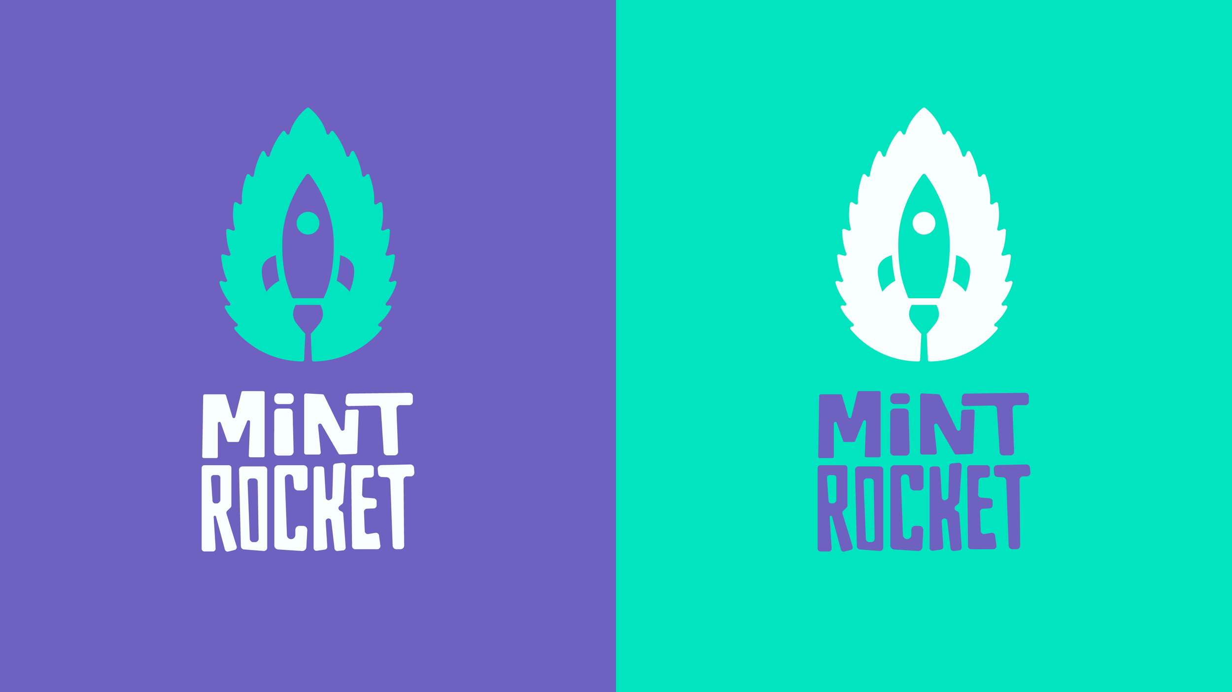
MINT ROCKET
PROBLEM:
I’ve been playing Dave the Diver by Mint Rocket. But everytime their logo came on screen I felt something was missing - It lacked some of the personality the brand and their games contained.
SOLUTION:
Taking the mint leaf and combining it with a more slick rocket takes the brand away from a more childlike look. Coupled with a custom font it gives the brand the personality it needs and begins to illustrate the genre-mashing games and vision Mint Rocket talk about. It has a playfulness, but feels more considered and has a stronger appearance.
ROLE:
Creative Director, Designer
ON THE BOX
The logo has a strong presence on the game box.
ANOTHER CONCEPT
This was the initial idea I had when thinking of the rebrand. I like it, but wasn’t convinced it was as simple as the above idea. It is, however, a mint rocket!


