SHIRO GAMES REBRAND
PROBLEM:
I was asked to consult on the naming for the new Shiro Games publishing arm, however they created the brand mark themselves. I always felt it needed a little bit more love and thought.
SOLUTION:
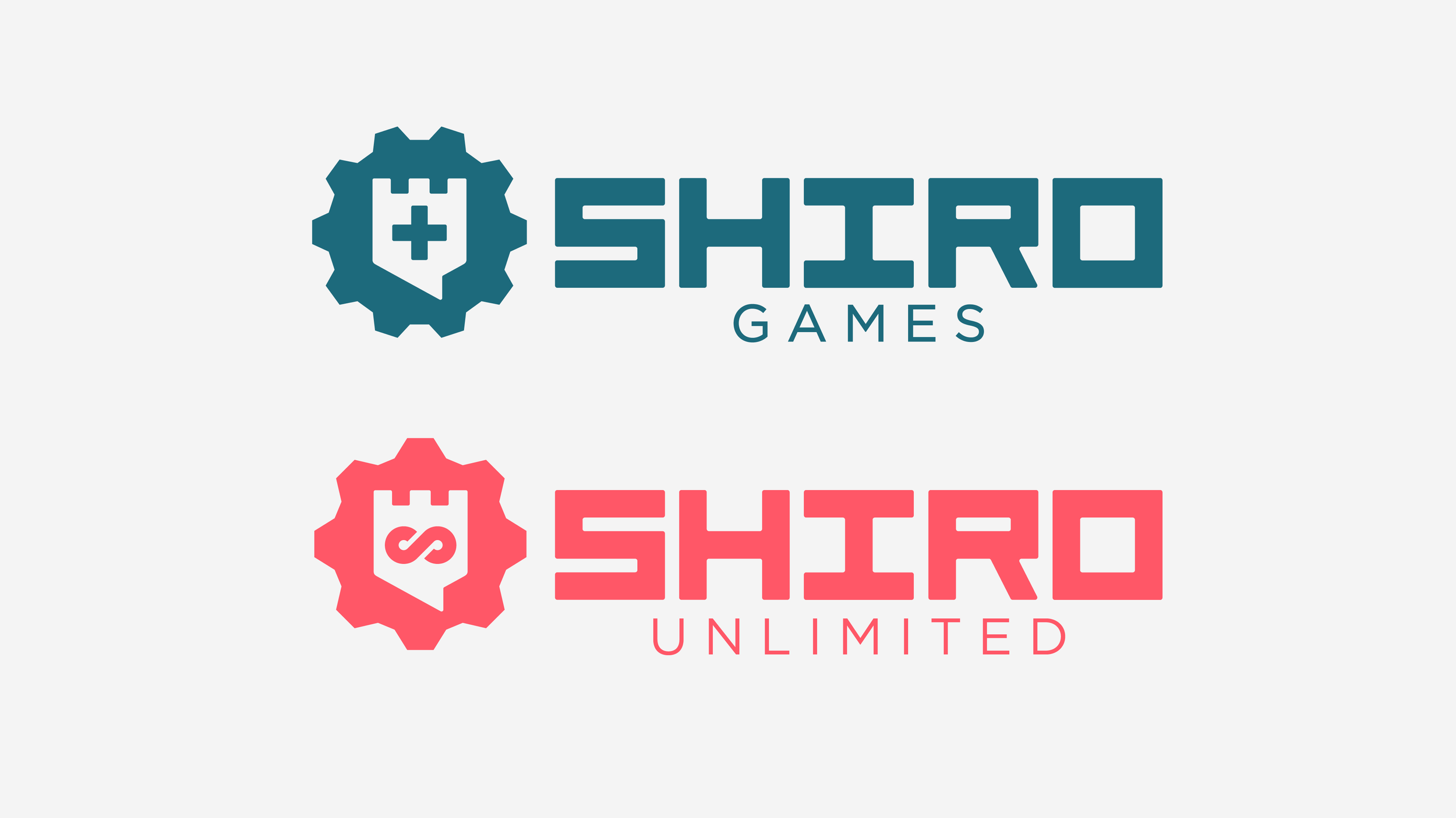
Reviewing the logos of Shiro Games and the new publishing arm Shiro Unlimited, I noticed a lack of consistency and a design that, whilst may have been mathematically correct, looked off. So I created a new grid and then pushed the brand further.
ROLE:
Creative Director, Designer
EVOLVING THE BRAND
Taking influence from the previous brand marks we kept the recognisable castle as the bolder part of the symbol (Shiro means castle in Japanese), however we added a symbol to each castle - the D-Pad symbol for Shiro Games and the Infinity symbol for Shiro Unlimited - giving more meaning to those symbols. With different machine parts and colour palette, they feel part of the same family, but are also instantly distinct.
PUSHING IT FURTHER
But what if we gave the typography more of a ownable personality? Taking influence from Japanese characters, but still feels western, we gave Shiro an ownable logotype that better suited the shapes of the symbol and the brand.
More MEMBERS OF THE FAMILY
The new concept and design enables Shiro to easily add more members to the brand family - such as a charitable foundation.


